

If you’ve ever tried to time a Bitcoin buy or sell, you know how unpredictable the cryptocurrency market can feel. One day prices are down, the next they’re on a rocket ride. No wonder many investors look for tools to help them make sense of this chaos. One of such tools is the Bitcoin Rainbow Chart, a colourful, long‑term price map that turns years of data into an easy‑to‑read graphic. But what exactly is it, and how can you use it to your advantage?
What is the Rainbow Chart?
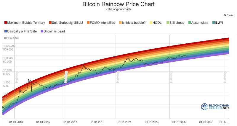
Imagine plotting Bitcoin’s price on a graph that doesn’t just scale up in a straight line, but curves logarithmically to plot the price action. Those lines have layers of a series of colour bands, red at the top through yellow and green, down to blues and purples at the bottom. Each shade shows a different stage of market sentiment, from bearish to bullish.
The chart is built from historical price data and a logarithmic regression line that smooths out Bitcoin’s volatility, making long‑term trends easier to spot.
It doesn’t forecast future prices with any precision. However, it offers a visual framework and context to where current prices sit relative to long‑term trends.
Bitcoin Rainbow Chart Colors
Bitcoin Rainbow Chart has 9 colors and each color represents different market sentiment and phase of the bitcoin price cycle.
![]()

- Red sits at the very top and signals that Bitcoin might be highly overvalued.
- Orange suggests prices are nearing an overbought state.
- Yellow is a more neutral zone. It implies that prices could move sideways.
- Green serves as a “buy zone,” indicating the asset is likely undervalued.
- Blue and purple at the bottom highlight deep discounts. When the price of bitcoin is in this region, it is considered as a prime time for entries for long term investments.
How to use Bitcoin Rainbow Chart
While the rainbow chart is appealing to look at, it’s only one piece of a broader investing process. If you understand this tool, you can use it to your advantage.
Start with a trustworthy version, such as the BlockchainCenter. Choose your time frame. The rainbow is most useful on weekly or monthly views, where long‑term trends are clearer. Daily charts can be noisy and may tempt you into reacting to short‑lived spikes. Use it alongside other indicators. A relative strength index (RSI) can tell you whether Bitcoin is overbought or oversold on shorter time frames. Likewise, a 200‑day moving average gives a sense of the broader trend. These additional signals help confirm whether a price sitting in, say, the green band is truly a buying opportunity or just a brief dip.

This tool works less for traders. Since this is a long term tool, it is more useful to the long term investors. Those investors who are willing to hold Bitcoin over a Bitcoin price cycle can benefit from this.
Also, it is better to keep a perspective. Bitcoin’s price history includes “halving” events every four years, when the block reward for miners is cut in half. Crypto prices often hover in the lower bands before a halving and climb toward higher bands afterward, though there have been only a few halvings so far, so this pattern isn’t guaranteed.
Regardless of halving cycles, remember the rainbow chart is descriptive, not predictive. Use the chart as a compass rather than a crystal ball, and be ready to adjust your plan when conditions change.
Current Stage of Bitcoin Rainbow Chart:
As of today, the Bitcoin Rainbow Chart shows the price at $113,361. This places it in the red zone marked “Maximum Bubble Territory.” According to the chart, this area has historically signaled that Bitcoin may be overvalued.
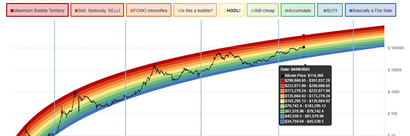

The rainbow bands are based on a logarithmic regression model and show how price movements fit into long-term trends. Prices in the red zone are well above the historical average trend line, which means risk is high. Investors should be cautious at this level, as the chart suggests that previous peaks near this zone were followed by corrections.
Always do your own research. News, global events, or sudden investor shifts can push prices above or below bands very quickly. That’s why no single band should ever be treated as a final buy or sell signal. Instead, use the chart as one part of a larger toolkit.